
PARKINSON’S AUSTRALIA

BRANDING / WEBSITES / APPLICATIONS
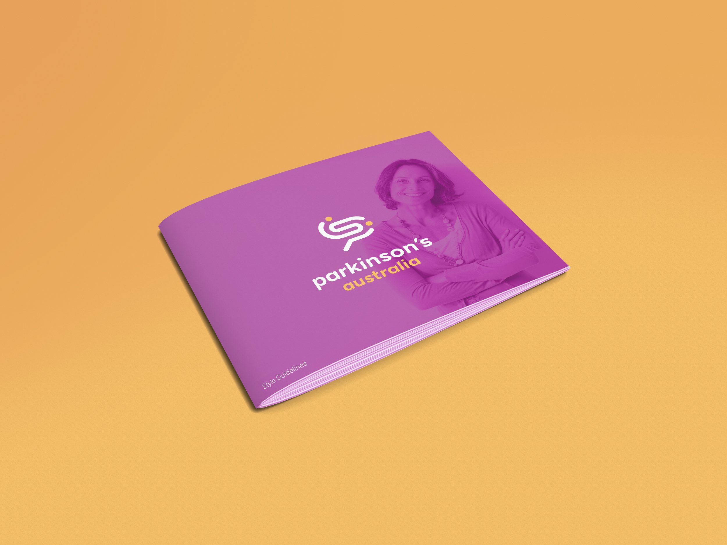
Pink brochure with a smiling woman and the text "Parkinson's Australia" on a yellow background.
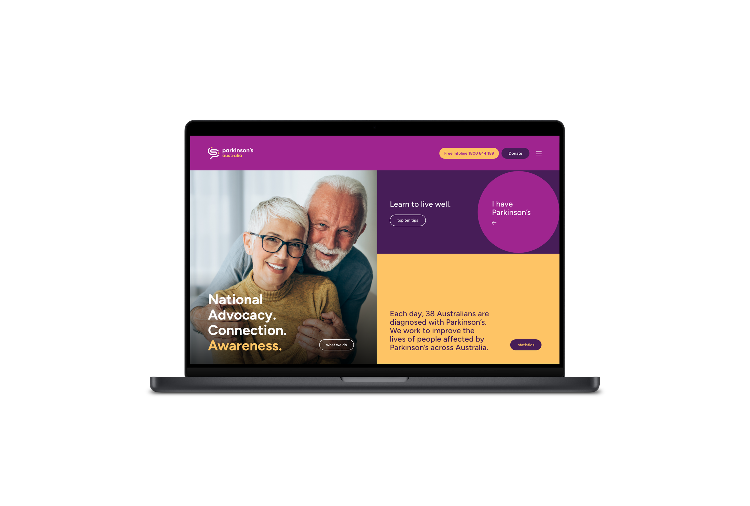
A computer screen displaying the website of Parkinson's Australia with a purple and yellow color theme, showing a photo of smiling elderly man and woman, with text about living well and awareness of Parkinson's disease.
Abstract graphic with a stylized hand on a purple and gray background.
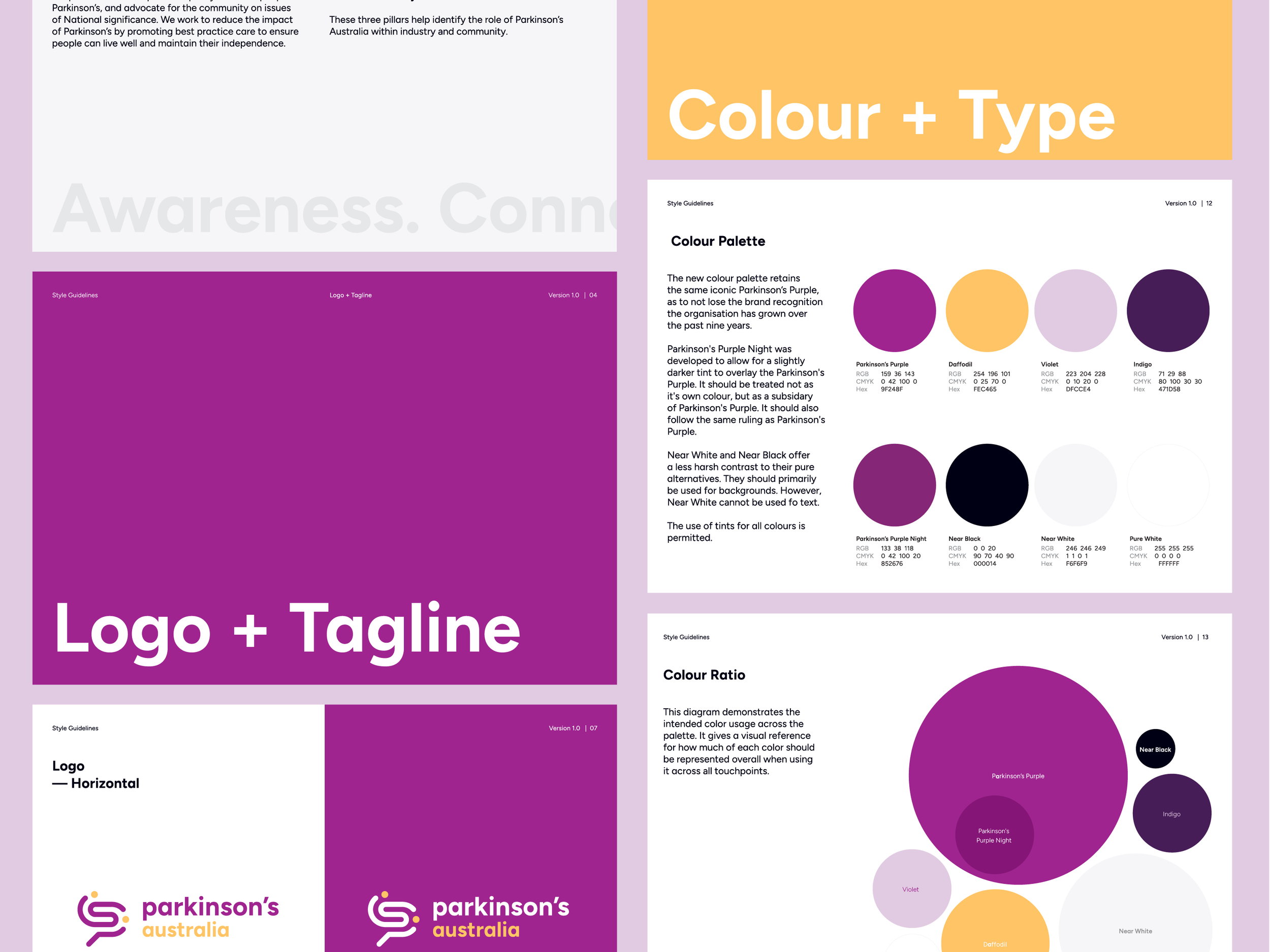
A colorful infographic about branding and color use, featuring sections on logo, tagline, color palette, and color ratio. Prominent colors include shades of purple, yellow, black, white, and various complementary tones, with sections discussing color guidelines, palette, and appropriateness of color choices.
Close-up of a purple background with the text 'Parkinson's Disease Education Exchange' and a stylized 'PD' logo.
A purple background with white and teal text that reads "90x".
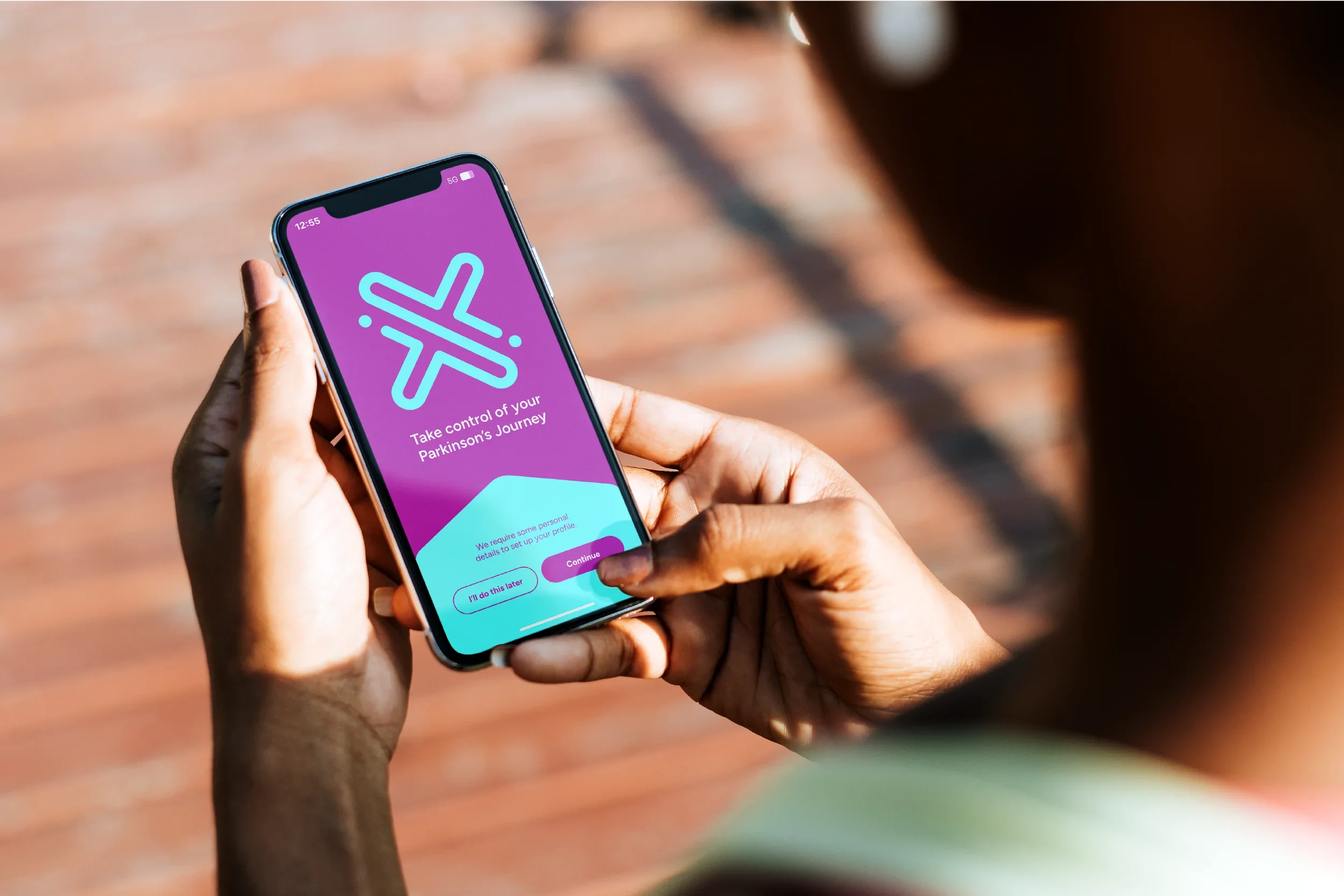
Person holding a smartphone with a purple screen displaying an airplane icon and text about Parkinson's journey.

Parkinson’s Australia is the national advocacy body for people living with Parkinson’s disease, inclusive of their families and carers, researchers and health professionals.

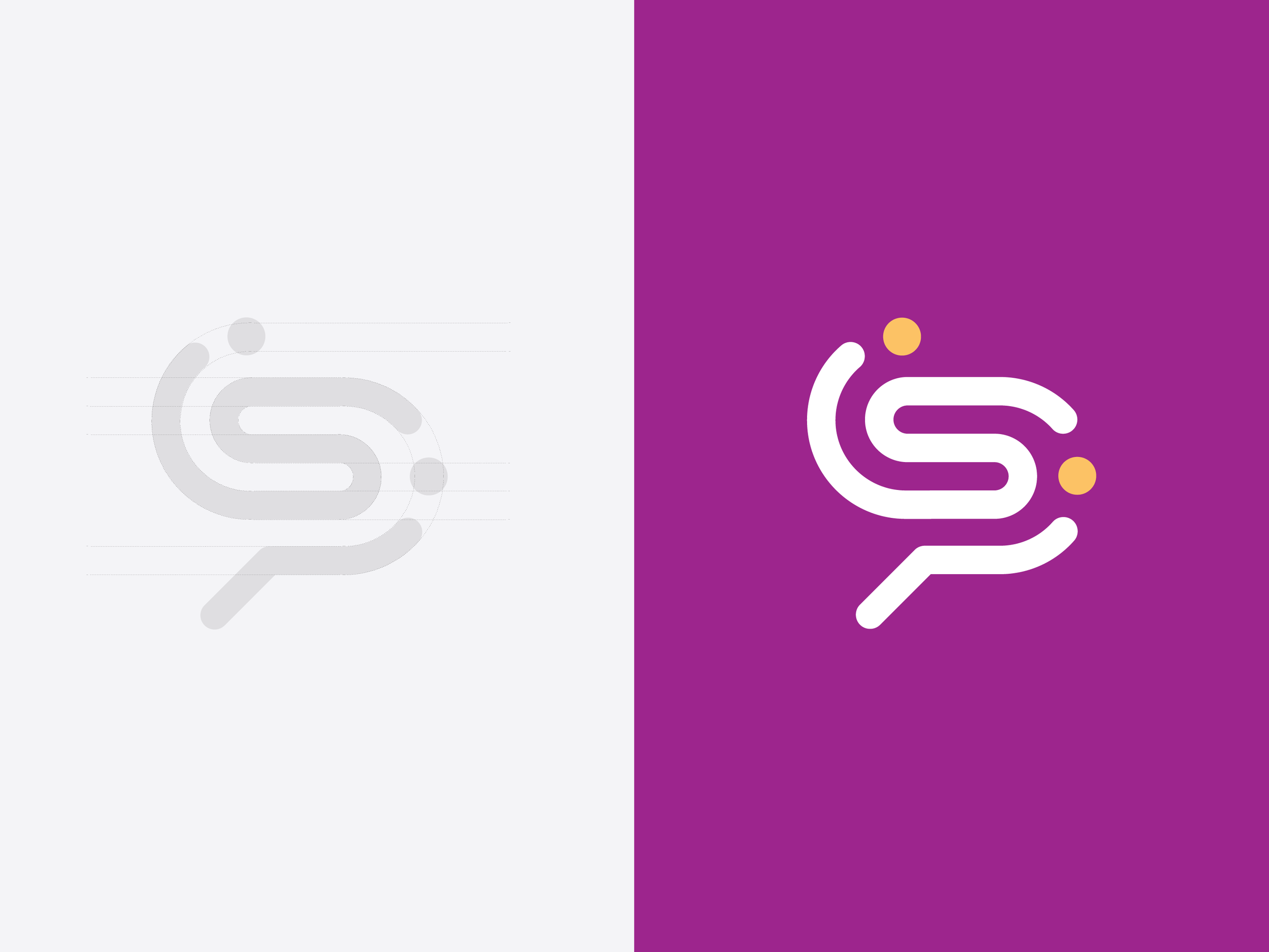
Toolbox were engaged to help Parkinson’s develop a brand identity that encapsulates the organisations vision to promote how to live well with Parkinson’s. The logo speaks to connection, community and the brain, while also resembling the letter ‘P’. A set of modular patterns were also developed to incorporate an illustrative element to the branding suite, acting as an extension of the logo, and further speaks to the pathway to better care for Parkinson’s disease.

Toolbox extended this identity into a suite of brand assets and media such as corporate documents, signage, iconography, and a website, which acts as a current and comprehensive resource for people living with Parkinson’s and their families.