

RIVERBANKS COLLEGE
BRANDING / APPLICATIONS / STYLE GUIDE

Toolbox won a competitive pitch issued by the Department of Education to design an identity for Riverbanks College, a multi-million dollar new school being built in Angle Vale, in Adelaide’s North. Stage one involved an in-depth Brand Strategy session where we established the school’s values, brand positioning and brand voice, to inform the design stage. This helped inform the school’s positioning statement:
“Creating an inclusive B–12 educational community, through world-class teaching and learning in state-of-the-art facilities, to foster kind and resilient life-long learners, who will thrive in tomorrow’s world.”
True to this, Riverbanks seeks to create a safe and nurturing space in today’s education environment. Their core values centre around kindness and collaboration within an inclusive community. The college strives to inspire every student, whilst giving them the grit and determination to build resilience required to be equipped for the future.
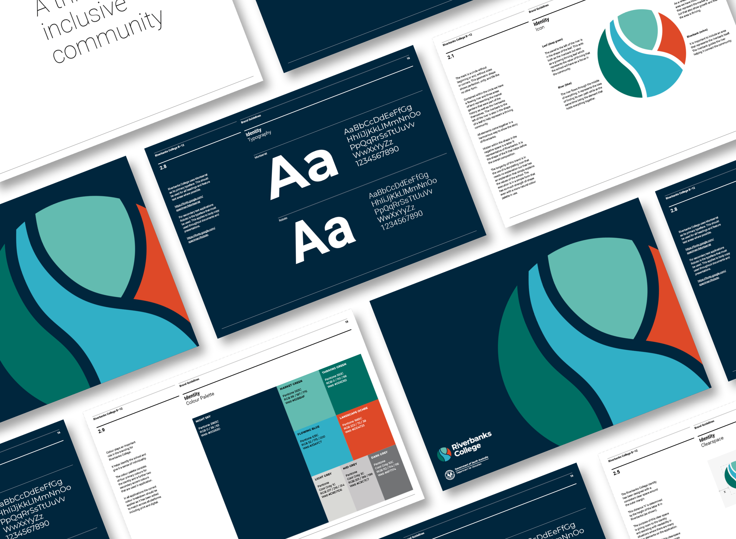
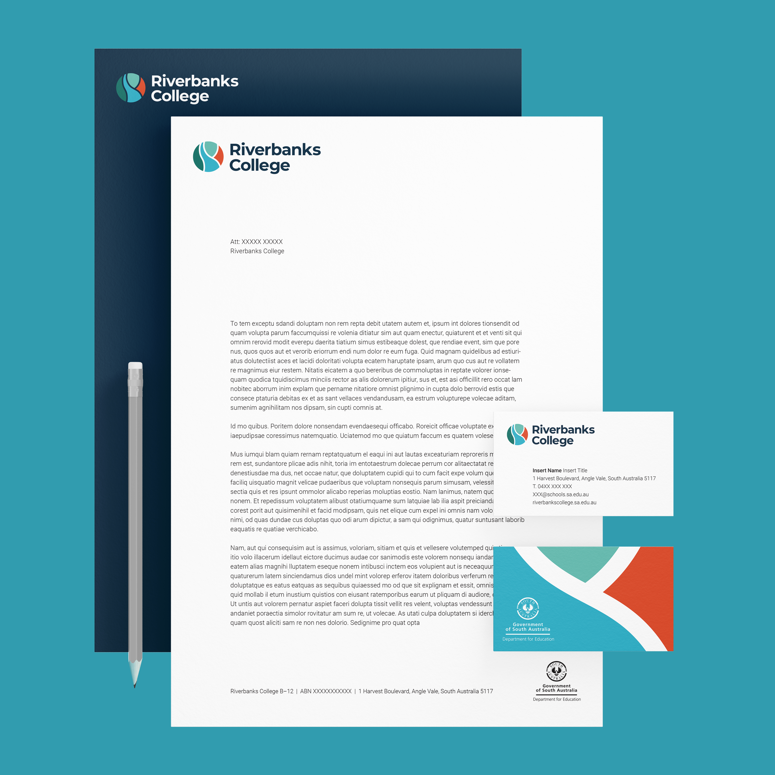
The final logo is an illustrative mark contained in a circle – a shape that speaks to inclusivity and nurturing of a school which welcomes students from birth through to year 12. Contained within the circle is a flowing river and three areas of land that represent the market gardens – an integral part of the riverbanks (the school’s context). The letter R is hidden inside the negative space of the mark. This not only connects to the Riverbanks name, but also plays a large part in defining the overall composition of the logo.
The chosen colour palette corresponds with the natural elements depicted in the logo – the red ochre of the landscape, flowing blue of the river, and thriving green of its surrounds. All these elements come together to tell the ongoing story of Riverbanks College.