

RUBBER SIDE DOWN
BRANDING / MERCHANDISE / APPLICATIONS
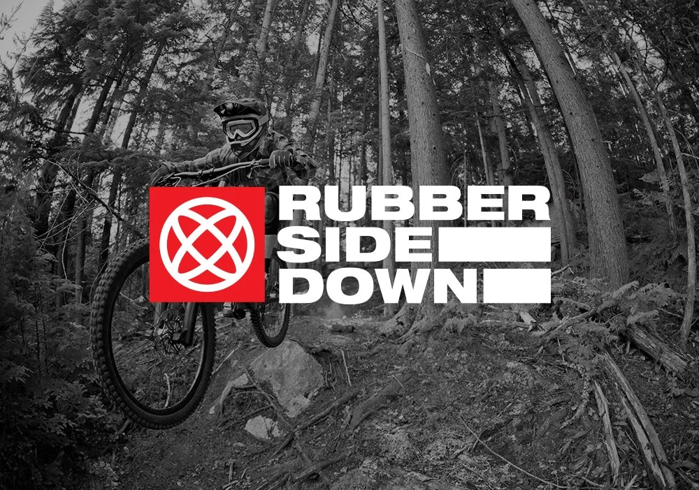
In the world of mountain biking, it’s a fine line between riding hard and hitting the ground hard. Staying upright is what our client calls ‘Rubber Side Down’.
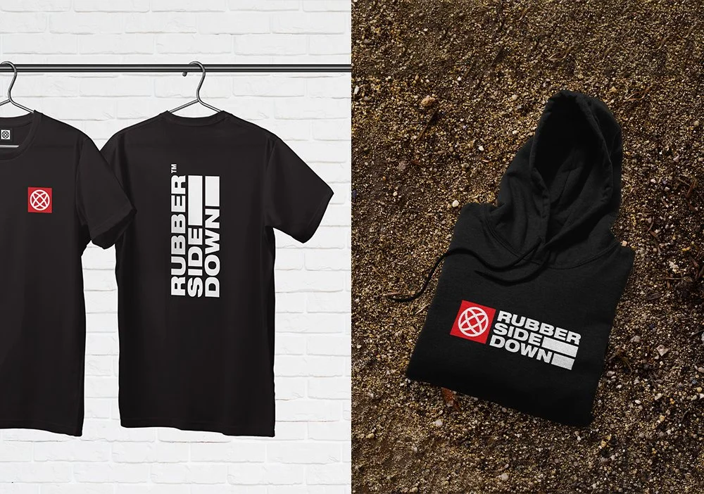
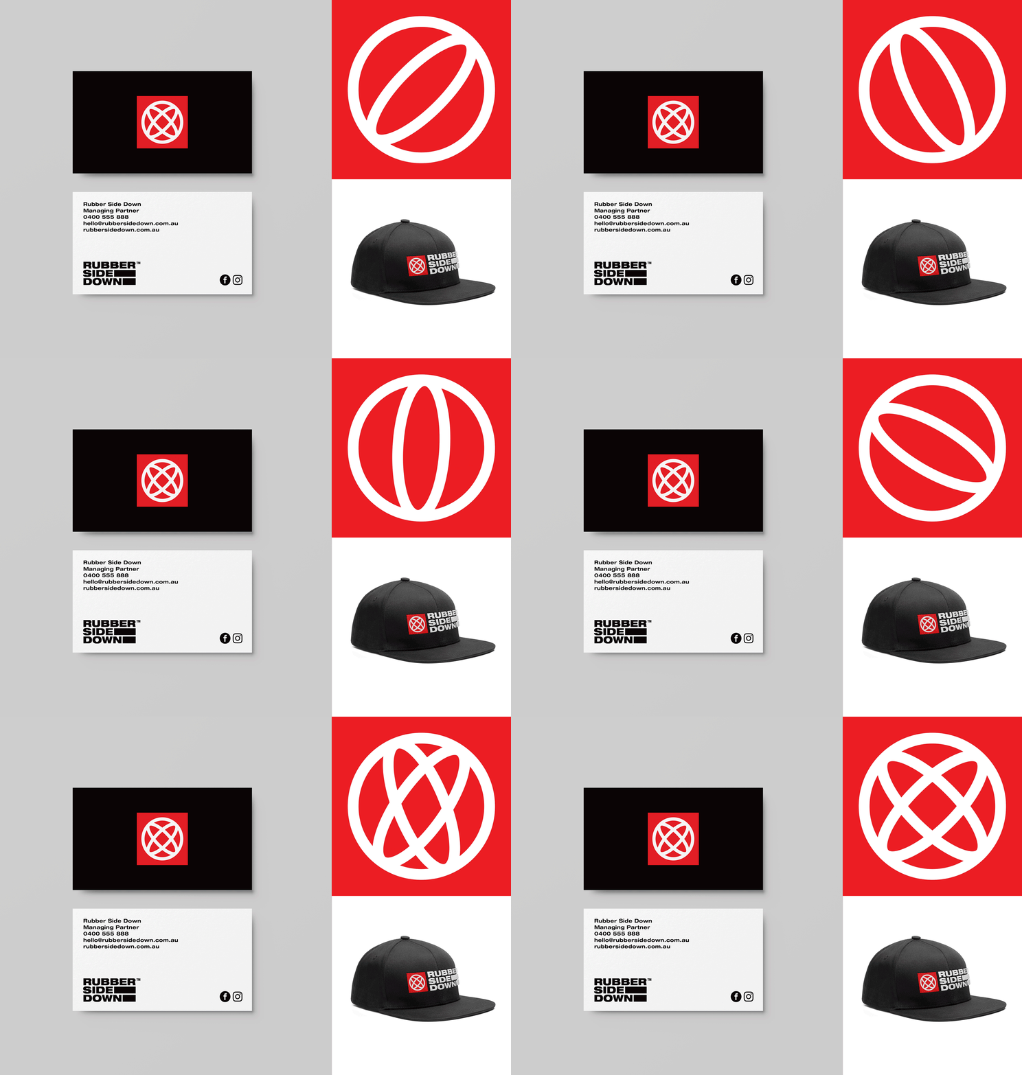
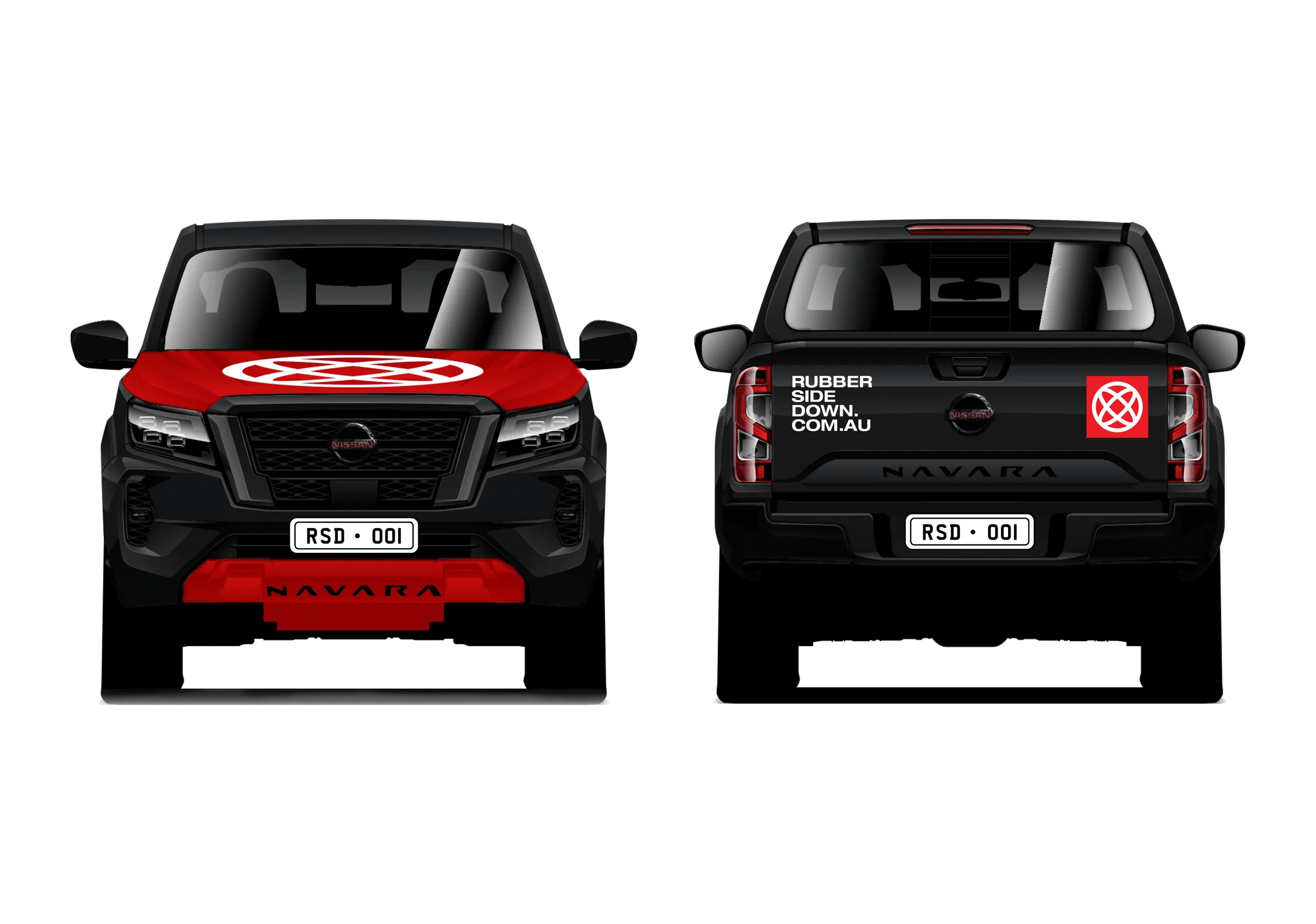
We worked with Rubber Side Down to develop a distinctive identity, a suite of activewear, various corporate collateral and website. Our brand solution takes inspiration from the tread of bike tyres (reflected in the block typography), the spin of wheels, and the terrain of the globe. We then applied the brand to a fashion/activewear range able to stand the test of rugged terrain and muddy dirt tracks. In an industry with very few locally designed options, Rubber Side Down have hit the ground running with their commitment to sustainable, ethically-sourced and environmentally responsible options.